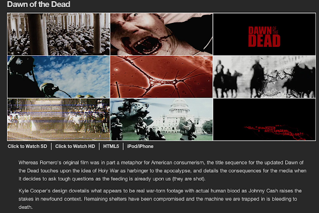
This title sequence is a good example as it does not reveal much about the story and therefore it makes the viewer want to continue.
This title sequence is effective and could be used as the font matches the tone of the film by making the font seem like it has been scratched onto the screen. Also it could be effective as it fits the music as the music seems to be calm but uneasy which is what the font also suggests.
This title sequence is effective because as the titles are going up, we get a birds eye view of the car as it goes through the mountains, showing that they are fully isolated and alone and also a long way from civilisation which adds to the tension. The titles also come up in a striking blue which stands out which further confuses the viewer. The shots here also show the different terrains showing the more the titles go on, the further they are from rescue and also as the shots show a mountiainn, if they go further up the mountain, they are less likely to come back down
I have included more screen shots of other Horror movies
I have chosen this shot because it shows how to intrigue the viewer as the titles are going downwards showing that the titles match the film on a hole.
I have chosen these shots because it opens very dramatically and gives a lot for the viewer to think about as it goes straight into the story with not a lot of introduction in the title sequence. The titles are also fixed into the opening sequence as the titles are a result of blood that is splattered on the screen.


No comments:
Post a Comment